
Michiko Imai 今井美智子 (b. 1969)
[Back to Exhibition Homepage]
Jump to:
中文 Chinese | 日本語 Japanese | 한국인 Korean | English
中文 Chinese
Milky Way, 2016
Sumi ink on gasenshi or xuan paper
41 cm x 61.5 cm (16”x24”) with mounting
書法疊加在以淡墨將地面斜切成兩半的波浪形段落上。 詩中使用了現代作家夏目漱石(1867-1916 年)的俳句,意象指的是銀河。詩的內容是
別るや-夢の筋の 天の川
離別,銀河邊的夢。
這首俳句也暗指一個在日本家喻戶曉的中國古典浪漫思念故事。今井的草書將漢字與日語平假名混合在一起,輕盈飄逸,三行呈降序排列,與銀河的形態相呼應。
Virtue(s) (Bitoku 美徳), 2013
Sumi ink on gasenshi or xuan paper
92 cm x 65.5 cm (36”x 26”) with mounting
92 cm x 48 cm (36”x 19”) without mounting
這幅作品只用了兩個有力的毛筆字,繼承了戰後日本流行的 「Shōjisūsho 少字數書」,即 「少字書法」。這種書體強調的是極少漢字的視覺力量。這種書體特別適合在茶室和沈思的時刻使用,它以簡潔的形式提煉出深刻的意義。美德,以粗獷的筆觸和如畫的構圖吸引觀者的注意力,寓意做人的根本目標。
Ordinary Mind is the Way (Byojōshin kore dō 平常心是道), 2013
Sumi ink on gasenshi or xuan paper, black obi silk (八雲柄)
158 cm x 62 cm (62” x 24.5”) with mounting (with Bottom wood 68cm)
90 cm x 44 cm (35.5” x 17”) without mounting
一位女性裸體背對著觀眾,被濃密的黑髮包裹著。她的臀部附近掛著一個紅色的護身符(御守)。作品的標題恰到好處地置於右側,藝術家簽名和印章的上方。值得注意的是,人物的頭髮延伸至左側邊框,墨色在此過渡為黑色織物。這項細節彰顯了藝術家在捲軸裝裱方面的非凡技藝,挑戰了畫框的傳統界限。感性的圖案與佛教訊息形成矛盾,為藝術增添了一層複雜性。這件作品是今井 『女性 』系列的一部分。
The Way (Dō 道), 2017
Sumi ink on tan with gold flake paper, orange obi silk shizumi line
112cm x 76 cm (44”x 30”) with mounting (with bottom wood 82.5cm)
66 cm x 66 cm (26”x 26”) without mounting)
「道 」暗指中國的道家哲學,與那些崇尚與世界自然和不斷變化的秩序和諧共處的人產生共鳴。第二次世界大戰後,日本書法出現了一種強調一個或幾個大字力量的風格。「道」也可譯為道路、路徑、路線或原則。該字左側的古代詞源意為「奔跑」,而右側則描繪了一張長著一束頭髮的臉。兩者結合在一起,象徵著探索人生宏偉藍圖的旅程,無論是健行、順流而下或其他方式。 簡約的黑色裝裱,點綴以深紅色條紋,增強了書法所傳達的動態寧靜感。
Sound of harmony, 2011
Sumi ink on gasenshi or xuan paper, obi silk, shibori silk
160cm x 31 cm (63”x 12”) with mounting (with Bottom wood 37cm)
119 cm x 21 cm (46” x 8”) without mounting
藝術家擁抱可能性,將一張紙揉成一團,隨意塗上墨水,讓圖像有機性地浮現出來。由此形成的色調各異的狹長墨跡暗示著一個隱藏的訊息。雖然作品中出現的字符可能是無意的,但作品從根本上突出了人物與虛空之間的相互作用,同時強調了創作過程中與生俱來的驚喜元素。
日本語 Japanese
天の川、2016年
墨画仙紙
41 cm x 61.5 cm (16”x24”) 表具込み
21.5 cm x 36 cm (8.5”x 14”) 表具なし
淡墨の波線の上に墨書が重ねられており、その線は地を斜めに二分している。近代作家、夏目漱石(1867年-1916年)の以下の俳句の言葉を使い、天の川をイメージしている。別るるや夢一筋の天の川この俳句は、日本でもよく知られている中国の古典に由来するロマンチックな恋の物語も示唆している。漢字とひらがなを混ぜた今井の調和体は軽やかで、3行は銀河の形と呼応するように下降している。
美徳、2013年
墨画仙紙
92 cm x 65.5 cm (36”x 26”) 表具込み
92 cm x 48 cm (36”x 19”) 表具なし
力強く筆を走らせたわずか2文字のこの作品は、戦後日本の「少字数書」の流れを汲んでいる。最小限の漢字の視覚的な力を強調するスタイルである。特に茶室や思索に耽るひとときに適しており、簡潔な形に深い意味を凝縮している。大胆な筆致と絵画のような構図で描かれた「美徳」は、見る者の心をとらえ、人生の本質的な目標を痛切に思い起こさせる。
平常心是道、2013年
墨画仙紙 黒帯(八雲柄)
158 cm x 62 cm (62” x 24.5”) 表具込み(軸棒込み 68cm)
90 cm x 44 cm (35.5” x 17”) 表具なし
全裸で背中を向けた女性が、太い筆跡の黒髪に包まれている。臀部には赤い「御守」をぶら下げている。作品のタイトルは、作者の署名と印章の上、右側に戦略的に配置されている。特筆すべきは、人物の髪が左の縁に伸びていることで、墨が黒い布に移り変わっている。掛け軸が設定する従来の境界線に挑戦する、表具における作家の卓越した技術を浮き彫りにしている。官能的なモチーフは、仏教のメッセージに逆説を提示し、作品をより複雑なものにしている。この作品は今井の「女性」シリーズの一部である。
道、2017年
墨金箔 画仙紙 朱帯
112cm x 76 cm (44”x 30”) 表具込み(軸棒込み82.5cm)
66 cm x 66 cm (26”x 26”) 表具なし
「道」は、中国の道教哲学を暗示しており、世界の自然や絶えず変化する秩序と調和して生きることを理想とする人々の心に響く。第二次世界大戦後、日本の書道界には、一文字あるいは数文字の大きな文字の力を強調するスタイルが出現した。「道」は、道、道筋、コース、原理とも訳される。古代の語源では、この字の左側は「走る」を意味し、右側は髪を束ねた顔を描いている。合わせて、徒歩や船での川下りなど、人生のグランドデザインを発見する旅を象徴している。黒を基調としたミニマルな台紙に、注意深く配置された朱色の帯がアクセントを添え、書が伝えるダイナミックな静謐感を高めている。
和の音、2011年
墨画仙紙 帯 絞り絹
160cm x 31 cm (63”x 12”) 表具込み(軸棒込み37cm)
119 cm x 21 cm (46” x 8”) 表具なし
作家は偶然を受け入れ、一枚の紙を揉み、無作為に墨をつけ、イメージを連鎖的に浮かび上がらせている。その結果、さまざまな色調の墨の滲みが細長い列を作り、隠されたメッセージを示唆する。意図しない文字が現れることもあるが、この作品は、創造的なプロセスに内在する驚きの要素を強調しながら、図と空白の相互作用を根本から浮き彫りにしている。
한국인 Korean
은하수 Milky Way, 2016
화선지 위에 수묵 잉크 사용Sumi ink on gasenshi or xuan paper
41 cm x 61.5 cm (16”x24”) 표구 포함 크기
21.5 cm x 36 cm (8.5”x 14”) 표구 제외 크기
바탕을 대각선으로 이등분하는 희미한 잉크의 곡선 길 위에 서예 글씨가 덮여 있다. 근대 시기의 작가인 나쓰메 소세키(1867-1916)의 하이쿠를 사용했으며, 은하수의 이미지를 담고 있다. 시는 아래와 같다.
別るるや—夢の筋の 天の川
Parting Ways, A Dream along the Milky Way.
이별의 길, 은하수를 따라가는 꿈
이 하이쿠는 일본에 잘 알려져 있는 중국 고전 이야기를 암시하는 것이기도 하다. 중국 한자와 일본 히라가나를 함께 쓴 이마이의 필체는 공기처럼 가벼운 느낌을 주며, 내려가는 모양으로 쓴 세 줄의 시는 우주의 형태를 떠올리게 한다.
미덕 Virtue(s) (Bitoku 美徳), 2013
화선지 위에 수묵 잉크 사용 Sumi ink on gasenshi or xuan paper
92 cm x 65.5 cm (36”x 26”) 표구 포함 크기
92 cm x 48 cm (36”x 19”) 표구 제외 크기
힘이 들어간 단 두 글자로 구성된 이 작품은 소자수서(少字数書, Few Character Calligraphy)로 불리는 전후 일본 서예의 경향을 따르고 있으며, 이러한 스타일은 적은 수의 한자를 통해 드러나는 시각적인 힘을 강조한다. 차를 마시는 방이나 사색의 시간에 특별히 잘 어울리는 이러한 종류의 서예는 깊이 있는 의미를 간결한 형태로 정제해 낸다. 대담한 스트로크와 그림 같은 구성으로 묘사된 ‘미덕’은 감상자의 주의를 집중시키며, 인생의 핵심 목표를 감동적으로 상기시켜 준다.
평범한 마음이 길이다 Ordinary Mind is the Way (Byojōshin kore dō 平常心是道), 2013
화선지 위에 수묵 잉크 사용, 검은색 오비 실크Sumi ink on gasenshi or xuan paper, black obi silk (八雲柄)
158 cm x 62 cm (62” x 24.5”) 표구 포함 크기 (아래의 나무 68cm)
90 cm x 44 cm (35.5” x 17”) 표구 제외 크기
굵은 붓의 스트로크를 닮은 검은 머리 여인의 모습이다. 그녀의 벗은 등은 그림을 감상하는 이들을 향하고 있으며, 붉은 색의 부적이 엉덩이 근처에 늘어져 있다. 작품의 제목은 오른쪽의 작가의 서명과 인장 위에 전략적으로 배치되어 있다. 주목할 것은, 이 사람의 머리카락이 왼쪽 경계로 연장되면서 잉크가 검은 색 천으로 바뀌어 펼쳐지는 것이다. 이러한 디테일은 이 작가의 뛰어난 표구 솜씨를 보여주는 것인데, 프레임으로 인해 한정되었던 기존의 경계 처리에 대한 도전이라 하겠다. 선정적인 모티프는 불교적인 메시지에 대한 역설을 보여주면서, 이 작품에 복잡성을 더해준다. 이 작품은 이마이의 “여인” 시리즈의 일부이다.
길 The Way (Dō 道), 2017
어두운 색상의 골드 플레이크 종이 위에 수묵 잉크, 오렌지 색 오비 실크 시즈미 선 Sumi ink on tan with gold flake paper, orange obi silk shizumi line
112cm x 76 cm (44”x 30”) 표구 포함 크기 (아래의 나무 82.5cm)
66 cm x 66 cm (26”x 26”) 표구 제외 크기
‘도(道)’는 중국 철학인 도교와 관련된 것으로, 자연적이면서 계속 변화하는 세상의 질서와 조화를 이루며 살고자 하는 이상을 가진 사람들에게 공감을 받는다. 제2차 세계 대전 이후 일본의 서예에는 한 글자 혹은 적은 수의 글자가 주는 힘을 강조하는 스타일이 등장했다. ‘도’라는 단어는 길, 통로, 여정, 또는 원칙으로도 번역될 수 있는데, 고대 어원으로 보면 이 글자의 왼쪽 변은 ‘달리다’는 뜻이 있고, 오른쪽은 머리가 촘촘하게 난 얼굴을 묘사한다. 이를 합쳐보면 걸어서 가거나, 강물에 배를 띄우거나, 또는 다른 방법을 이용하여 인생의 큰 설계를 찾아가는 여행을 상징한다고 하겠다. 미니멀한 분위기의 검은색 표구는 신중하게 배치한 진홍색 스트립의 액센트로 장식되었으며, 이는 글씨가 전하는 역동적인 고요함을 한층 더 끌어올려 준다.
화합의 소리 Sound of harmony, 2011
화선지 위에 수묵 잉크 사용, 오비 실크, 시보리 실크 Sumi ink on gasenshi or xuan paper, obi silk, shibori silk
160cm x 31 cm (63”x 12”) 표구 포함 크기(아래의 나무 37cm)
119 cm x 21 cm (46” x 8”) 표구 제외 크기
작가는 종이 한 장을 구기고 무작위로 거기에 잉크를 닿게 하여 자연적으로 이미지가 생겨나게 했으며, 이를 통해 우연이라는 요소를 적용하였다. 그 결과, 여러가지 톤의 길고 좁은 잉크 얼룩이 생겨났고 이는 감추어진 메시지를 암시한다. 의도하지 않은 글자가 나타날 수도 있지만, 이 작품은 기본적으로 어떤 형태와 빈 공간 사이의 상호작용을 부각하고 있으며, 이러한 창작 과정에서 생겨나는 예상치 못한 놀라움을 강조하고 있다.
English
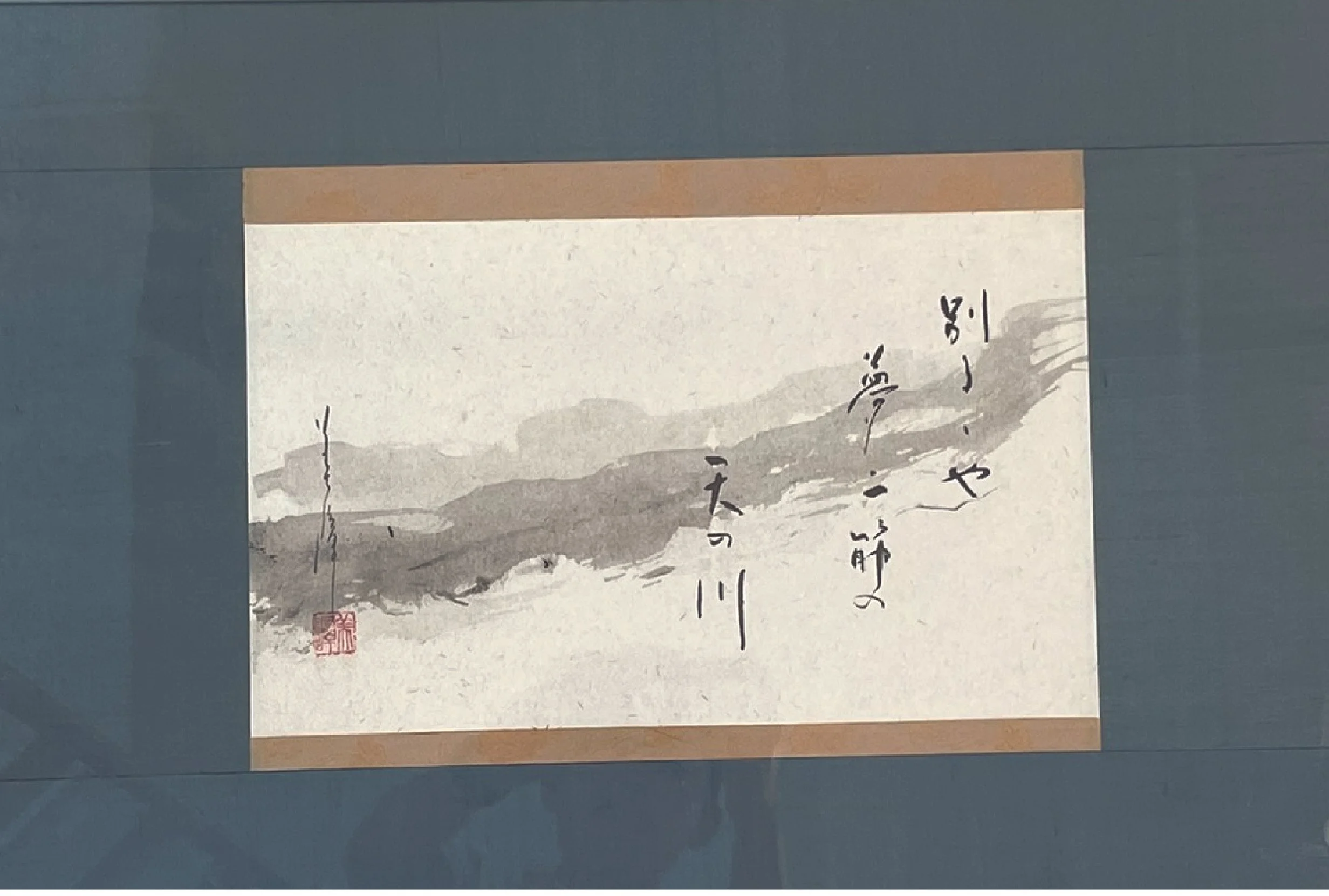
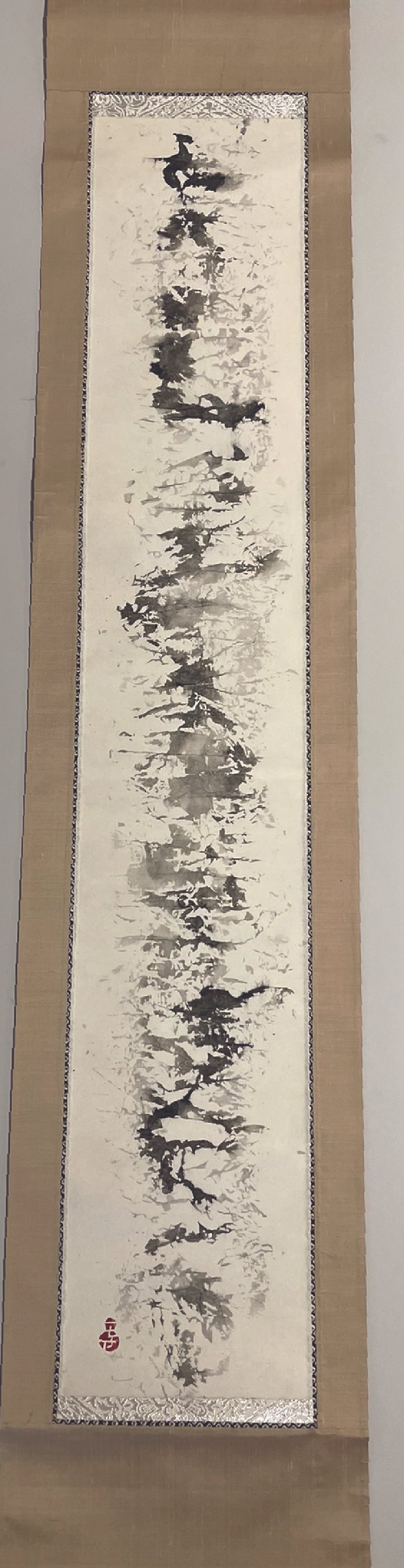
Milky Way (天の川), 2016
Sumi ink on gasenshi or xuan paper
41 cm x 61.5 cm (16”x24”) with mounting
21.5 cm x 36 cm (8.5”x 14”) without mounting
The calligraphy is overlaid on a wavy passage in pale ink that bisects the ground diagonally. Using the words of a haiku by the modern writer Natsume Sōseki 夏目漱石 (1867-1916), the imagery refers to the Milky Way. The poem reads:
別るるや夢一筋の 天の川
Parting Ways, A Dream along the Milky Way
This haiku also alludes to a classical Chinese story of romantic longing well known in Japan. Imai’s cursive hand, mixing Chinese characters with Japanese hiragana, is light and airy, with the three lines in a descending arrangement to echo the form of the galaxy.
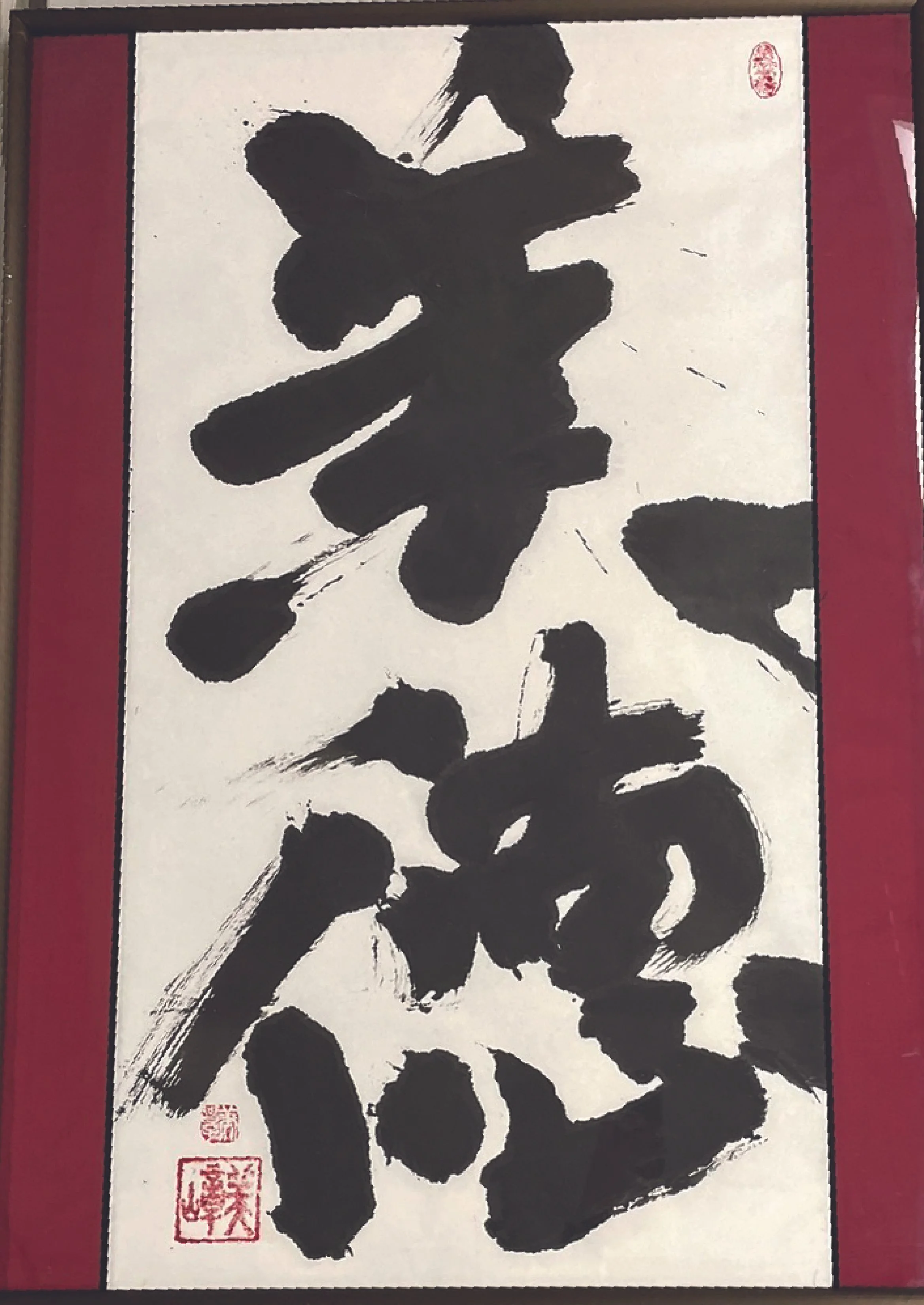
Virtue(s) (Bitoku 美徳), 2013
Sumi ink on gasenshi or xuan paper
92 cm x 65.5 cm (36”x 26”) with mounting
92 cm x 48 cm (36”x 19”) without mounting
With just two forcefully brushed characters, this work is heir to the postwar Japanese trend known as Shōjisūsho 少字数書, or Few Character Calligraphy. This style emphasizes the visual power of a minimal number of kanji (Chinese characters). Particularly suited for the tearoom and moments of contemplation, this genre of calligraphy distills profound meaning into a succinct form. Virtue(s), depicted with bold strokes and a picture-like composition, captures the viewer’s attention and serves as a poignant reminder of life’s essential goal.
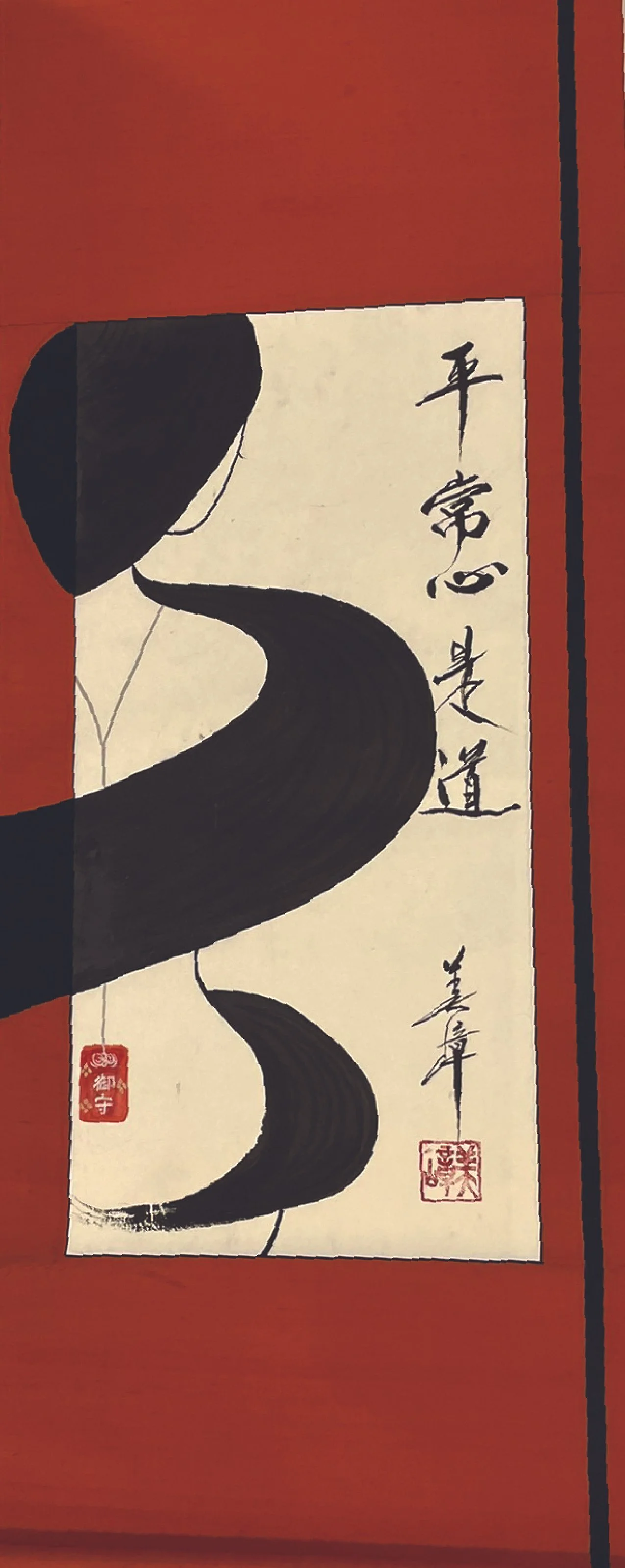
Ordinary Mind is the Way (Byojōshin kore dō 平常心是道), 2013
Sumi ink on gasenshi or xuan paper, black obi silk (八雲柄)
158 cm x 62 cm (62” x 24.5”) with mounting (with bottom wood 68cm)
90 cm x 44 cm (35.5” x 17”) without mounting
A woman, her nude back turned to the viewer, is enveloped in black hair that resembles thick brushstrokes. She wears a red protective amulet (omamori 御守) hanging close to her buttock. The title of the piece is strategically placed on the right, above the artist’s signature and seal. Notably, the figure’s hair extends into the left border, where the ink transitions into black fabric. This detail highlights the artist’s exceptional skill in scroll mounting, challenging the traditional boundaries set by the frame. The sensual motif presents a paradox to the Buddhist message, adding a layer of complexity to the art. This work forms part of Imai’s “Women” series.
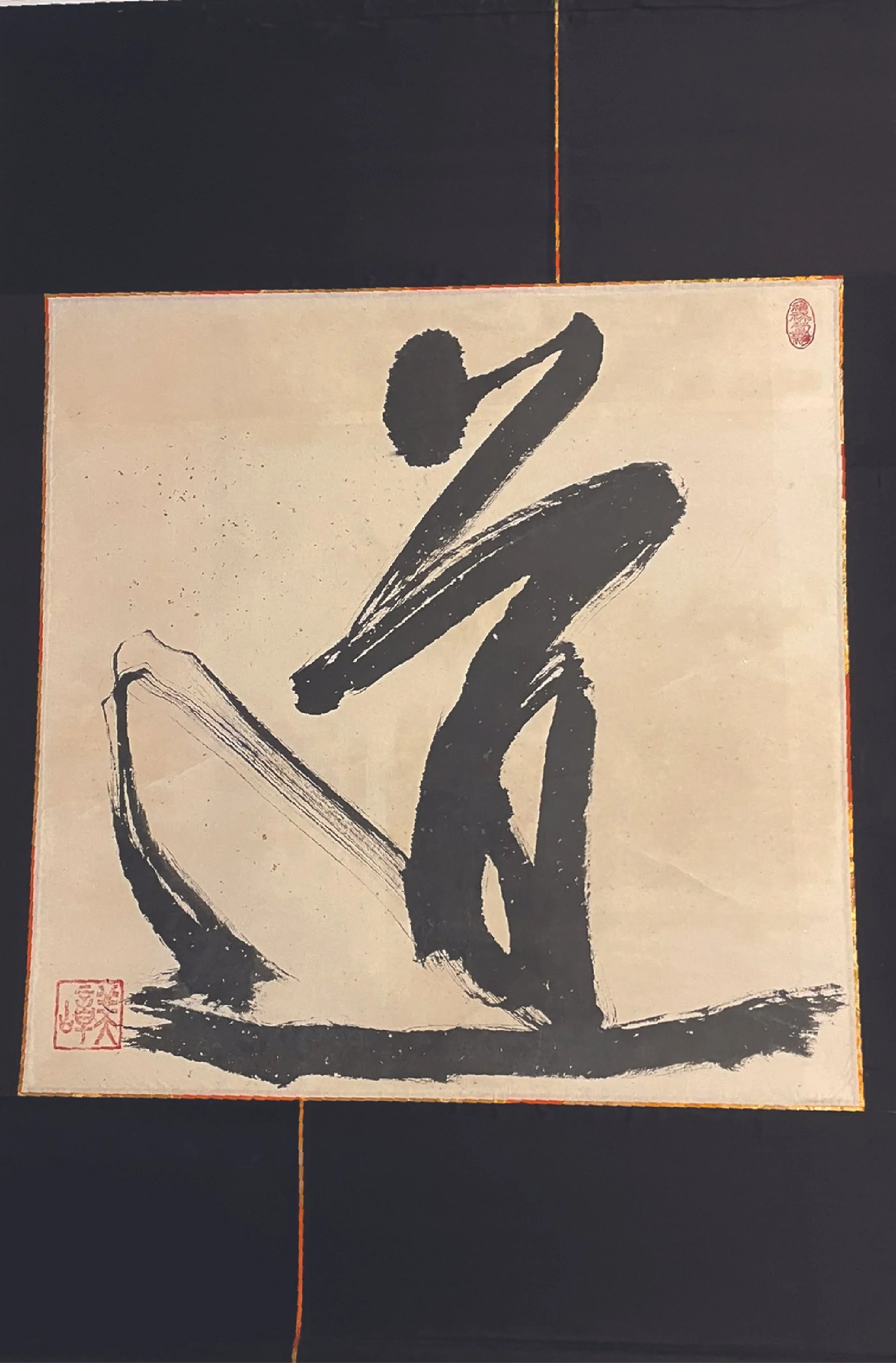
The Way (Dō 道), 2017
Sumi ink on tan with gold flake paper, orange obi silk shizumi line
112cm x 76 cm (44”x 30”) with mounting (with bottom wood 82.5cm)
66 cm x 66 cm (26”x 26”) without mounting)
"The Way," alluding to the Chinese philosophy of Daoism, resonates with those who embrace the ideal of living in harmony with the world's natural and ever-changing order. Following World War II, Japanese calligraphy saw the emergence of styles that emphasized the power of one or a few large characters. The word "way" can also be translated as road, path, course, or principle. The ancient etymology of the character's left side means "to run," while its right side depicts a face with a tuft of hair. Together, they symbolize the journey of discovering life's grand design, whether by traveling on foot, sailing down a river, or other means. The minimalist mounting in black, accented by thoughtfully placed crimson strips, heightens the sense of dynamic tranquility conveyed by the calligraphy.
Sound of Harmony (和の音), 2011
Sumi ink on gasenshi or xuan paper, obi silk, shibori silk
160cm x 31 cm (63”x 12”) with mounting (with bottom wood 37cm)
119 cm x 21 cm (46” x 8”) without mounting
The artist embraces chance, scrunching up a piece of paper, randomly applying ink, and allowing the image to emerge organically. The resulting long, narrow column of ink blots in varying tones hints at a hidden message. Though unintentional characters may appear, the work fundamentally highlights the interplay between figure and void, while emphasizing the element of surprise inherent in the creative process.