
YoungSun Jang 장영선 (b. 1976)
[Back to Exhibition Homepage]
Jump to:
한국인 Korean | 中文 Chinese | 日本語 Japanese | English
한국인 Korean
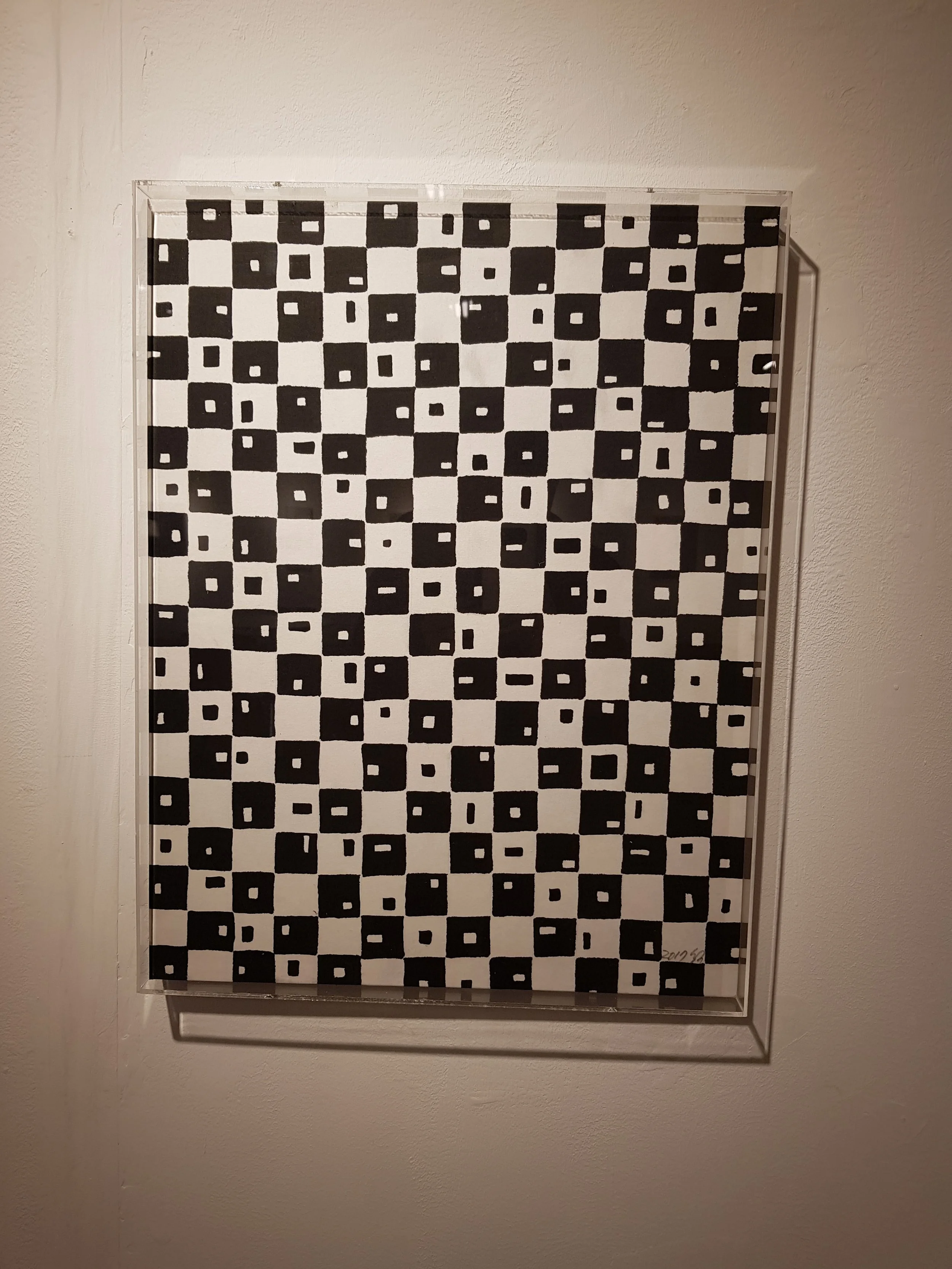
자음 중 ㅁ Consonant M (Ja-eum jung mi-eum), 2017
화선지 위에 잉크 사용
42cm x 54cm (16.5” x 21.3”)
이 작품은 한글 자음에서 사각형 상자 모양을 닮은 미음(ㅁ)에서 영감을 얻은 것이다. 작가는 반복과 회전을 사용하고 검은색과 흰색을 다양하게 배치하였으며, 전체적인 패턴을 만들어 내기 위해 다양한 크기를 가진 각각의 상자 속 공간 크기를 이용하였다. 하나의 자음을 시스템적으로 처리함으로써 시각적으로 복잡한 구성에서 미니멀리스틱한 형태의 아름다움과 다양성을 보여준다.
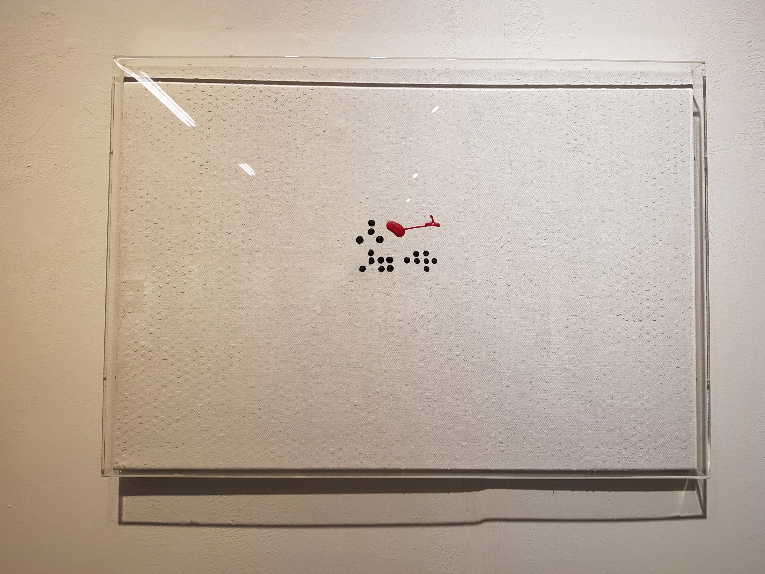
사랑해 I Love You (Saranghae), 2017
캔버스 위에 아크릴 사용
66cm x 46cm (26” x 18.1”)
이 작품은 기존의 평면적인 서예의 틀을 벗어나, 텍스처를 더욱 가까이서 감상하고 싶게 만든다. 하얀 바탕 위에 하얀 점이 잔잔하게 들어간 바탕은 은은하면서도 촉각적인 효과를 만들어 낸다. 검은 색 점은 점자로 ‘사랑해’를 쓴 것이며, 시각장애자들을 위한 또 한 겹의 커뮤니케이션을 통합한 것이다. 붉은 색 마크는 열린 해석을 가능하게 하는 요소로, 보는 사람들로 하여금 그 의미를 생각하게 하고 더욱 작품에 깊이 빠져들게 한다.
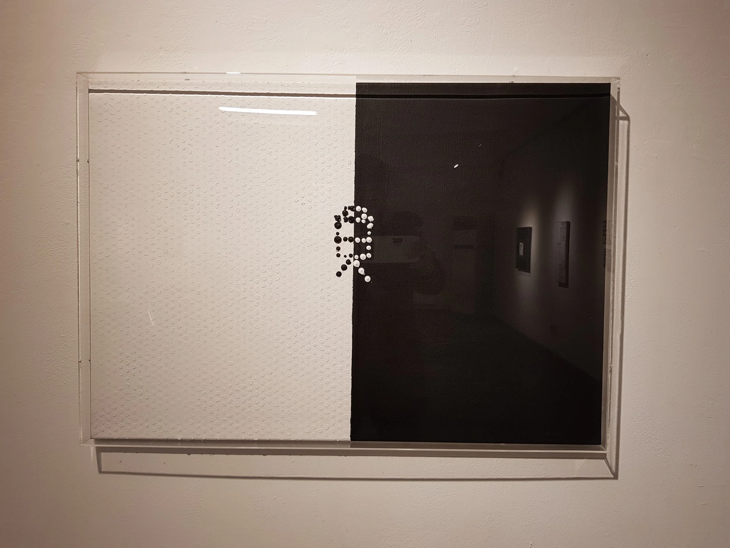
자음 중 ㅁ, ㅂ, ㅅ Consonant M, B, S (Ja-eum jung mi-eum, bi-eup, si-ot), 2017
캔버스 위에 아크릴 사용
66cm x 46cm (26” x 18.1”)
이 작품은 텍스처가 있는 배경 그리고 클래식한 서예의 흑과 백을 재구성한 캔버스 양면의 눈에 띄는 대비가 두드러진다. 구성의 중심부에는 한글 자음 ㅁ, ㅂ, ㅅ을 쌓은 독특한 그래프가 있는데, 이는 장 작가의 캘리그래프에서 계속 나타나는 모티프이자 뚜렷한 특징이다. 이러한 요소의 결합은 감상자들로 하여금 정체성 그리고 더 큰 전통 내에서의 예술적 표현이라는 주제를 깊이 생각해 보게 한다.
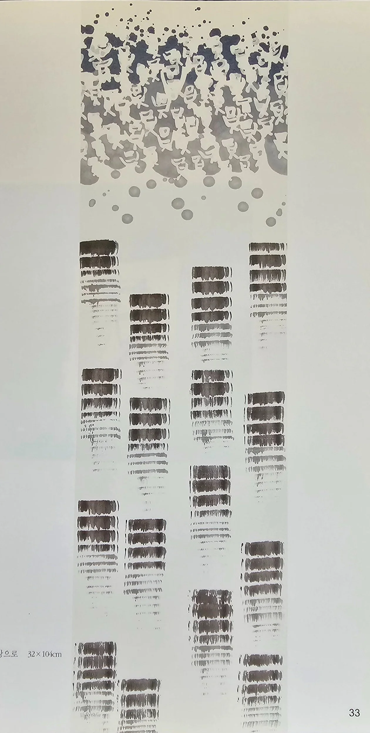
천상으로To Heaven (Cheon sang eu-ro), 2017
화선지 위에 잉크 사용
32cm x 134cm (12.6” x 52.8”)
한글 자음 ㅁ, ㅂ, ㅅ을 여러 개 배치하면서 몇 단계의 불투명한 잉크를 사용한 독창적인 조합의 작품이다. 자음 ㅁ, ㅂ, ㅅ의 배열은 장 작가가 즐겨 사용하는 실험적인 기법에 잘 어울린다. 이러한 자음들은 그 자체로는 아무런 언어적 의미가 없으나, 보는 사람이 직접 의미를 부여하여 개별적 해석이 가능하게 만든다. 작품의 나머지 부분은 어두운 톤에서 밝은 톤으로 바뀌는 여러 개의 잉크 블록으로 채워져 있고, 이는 보는 이들의 주의를 끌어오는 역할을 한다.
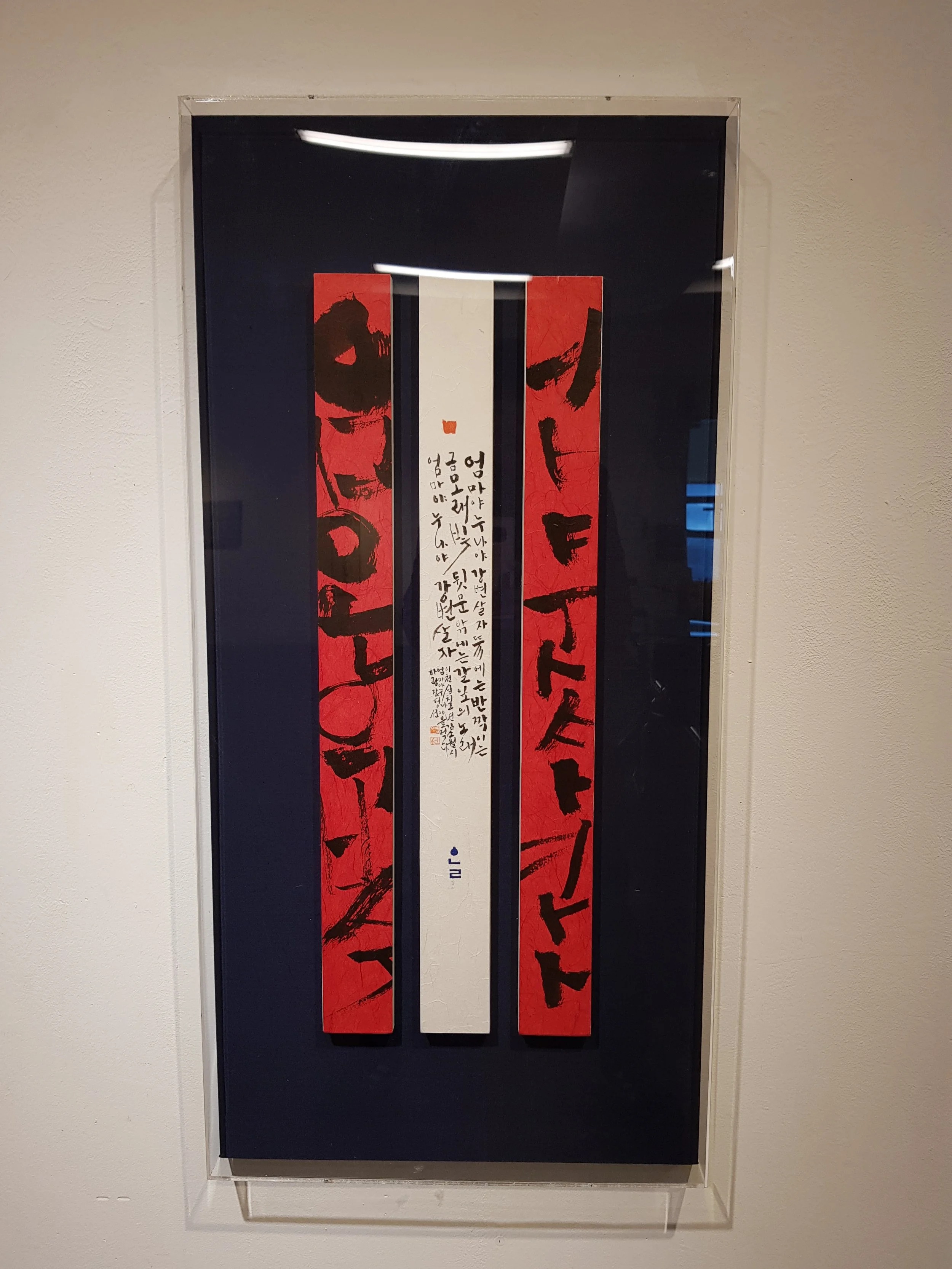
김소월의 시 ‘엄마야 누나야’ Kim Sowol’s Poem “Mom and Sis”, 2017
붉은 화선지 위에 잉크 사용 & 한국 한지(닥종이) 위에 잉크 사용
41cm x 84cm (16.1” x 33”)
세 폭으로 구성된 이 작품은 일본 강점기 시대의 대표적인 한국 시인인 김소월(金素月)의 슬픈 시를 참고로 한 것이다. 중앙 패널에는 ‘엄마야 누나야 강변 살자’라는 시가 적혀 있는데, 이는 안전하고 평화로운 삶에 대한 소망을 보여주는 은유이다. 왼쪽과 오른쪽에 있는 붉은 종이의 패널에는 이 시의 첫 부분에 나오는 단어인 ‘엄마야 누나야’와 마지막 단어인 ‘강변 살자’가 해체되어 배치되어 있는데, 이 두 개의 패널은 중앙 패널의 음성학적 소리를 완성하면서 이 작품의 시각적인 요소와 언어적인 요소를 연결해 준다.
中文 Chinese
Consonant M (Ja-eum jung mi-eum 자음 중 ㅁ), 2017
Ink on xuan paper
42cm x 54cm (16.5” x 21.3”)
這件作品的靈感來自韓文字母表,特別是 "m"(ㅁ)字,它像一個正方形的盒子。藝術家採用重複和旋轉的方式,在每個方框內穿插黑白變化和不同大小的內部空間,從而創造出一個整體圖案。對這單一輔音的系統化處理,展示了極簡形式在產生複雜視覺構圖方面的美感和多功能性。
I Love You (Saranghae 사랑해), 2017
Acrylic on canvas
66cm x 46cm (26” x 18.1”)
這幅令人回味的作品挑戰了傳統書法的平面感,主張質感並需要仔細觀察。背景由白色表面上的微小白點組成,營造出一種微妙的觸感。黑色圓點拼出點字片語 「我愛你」,為視障人士提供了一層溝通的障礙。紅色標記的出現增加了一個可解釋的元素,鼓勵觀眾思考其意義,更深入地接觸藝術作品。
Consonant M, B, S (Ja-eum jung mi-eum, bi-eup, si-ot 자음 중 ㅁ, ㅂ, ㅅ), 2017
Acrylic on canvas
66cm x 46cm (26” x 18.1”)
這幅作品以其紋理背景和兩半畫布之間的鮮明對比脫穎而出,重塑了古典書法的傳統黑白構圖。構圖的中心是一個獨特的圖形,它將韓國字母 M(ㅁ)、B(ㅂ)和 S(ㅅ)堆疊在一起,這是張氏書法中經常出現的圖案,也是張氏書法的獨特標誌。這種元素組合鼓勵觀眾在更大的傳統中思考身份和藝術表達的主題。
To Heaven (Cheon sang eu-ro 천상으로), 2017
Ink on xuan paper
32cm x 134cm (12.6” x 52.8”)
張別出心裁地將韓文字母符號 M (ㅁ) 、B (ㅂ) 和 S (ㅅ) 組合在一起,並以不同程度的墨水不透明度而倍增。子音 "M、B、S "的排列組合方式是張樂於嘗試的。這些子音在韓語中沒有任何意義,而是由觀者個人來詮釋其中意義。構圖的其餘部分由一系列墨色漸變的色塊佔據,從深色過渡到淺色,似乎在引導觀者的注意力沿著作品前進。
日本語 Japanese
子音M 、2017年
墨画仙紙
42cm x 54cm (16.5” x 21.3”)
四角に似た韓国語のアルファベット「m」(ㅁ)からインスピレーションを得た作品である。反復と回転を用い、黒と白のバリエーションを挟みながら、それぞれの四角内の空白の大きさを変えることで、全体的なパターンを作り出している。この一つの子音を系統的に操作することで、複雑な視覚的構成を生み出すミニマルな形の美と多様性を示している。
愛している、2017年
アクリル キャンバス
66cm x 46cm (26” x 18.1”)
何かを喚起させるような作品は、従来の書道の平面性に異議を唱え、質感が細かく見るように仕向けることを主張している。背景は、白い表面に細かい白い点で構成されており、微妙な触感を生み出している。黒い点は、点字で「I love you」と書いてあり、視覚障害者向けのコミュニケーション層を組み入れている。赤い印の存在が、解釈の余地を与える要素を追加しており、見る者に、その意味合いを考えさせ、作品とより深く関わることを促している。
子音M、B、S、2017年
アクリル キャンバス
66cm x 46cm (26” x 18.1”)
質感のある背景と、キャンバスの両半分の鮮烈なコントラストが際立っており、古典的な書道の従来の白黒の構成を刷新している。構図の中心となっているのは、韓国のハングル文字M(ㅁ)、B (ㅂ)、S (ㅅ)を積み重ねたユニークなグラフで、張永善の作品に繰り返し見られるモチーフで、独特のサインとなっている。こうした要素の組み合わせが、見る者に、より大きな伝統という枠組みの中でのアイデンティティや芸術表現のテーマについて考えさせる。
天国へ、2017年
墨画仙紙
32cm x 134cm (12.6” x 52.8”)
韓国のハングル文字M (ㅁ)、B (ㅂ)、S (ㅅ)の独創的な組み合わせが、さまざまな墨の濃淡によって掛け合わされている。書家が実験を楽しむように、子音「M、B、S」の並び方を組み合わせている。これらの子音は、韓国語で意味がなく、むしろ、見る者に、個人的解釈によって意味を与える様に促している。残りの構図は、濃淡のグラデーションからなる墨の一連のブロックで占められており、暗い色調から明るい色調に移行することで、鑑賞者の視点を作品に沿って誘導しているかのようである。
金素月の詩「お母さん、お姉さん」2017年
墨赤い画仙紙、墨 韓国半紙(楮紙
41cm x 84cm (16.1” x 33”)
この三連作では、日本植民地時代に活躍した韓国の著名な詩人、キム・ソウォル(김소월 金素月、1902年-1934年)の詩を引用している。中央のパネルには、安全で平和な生活への願いの隠喩である「お母さんとお姉ちゃん、川のほとりで暮らそう」という詩が書き写されている。赤い紙の左右のパネルは、詩の最初の文言「ママとお姉ちゃん」を分解し、最後の文言「川のほとりで暮らそう」が中央のパネルで音韻が終わるまで、それぞれの赤いパネルで区切られて表現されており、視覚的要素と言語的要素をつなげている。
English
Consonant M (Ja-eum jung mi-eum 자음 중 ㅁ), 2017
Ink on xuan paper
42cm x 54cm (16.5” x 21.3”)
This work draws inspiration from the Korean alphabet, specifically the character for "m" (ㅁ), which resembles a square box. The artist employs repetition and rotation, interspersing black and white variations, along with different sizes of the interior space within each box, to create an overall pattern. The systematic manipulation of this single consonant showcases the beauty and versatility of minimalistic forms in generating complex visual compositions.
I Love You (Saranghae 사랑해), 2017
Acrylic on canvas
66cm x 46cm (26” x 18.1”)
This evocative piece challenges the traditional flatness of calligraphy, asserting that texture invites closer examination. The background is composed of minute white dots on a white surface, creating a subtle, tactile quality. Black dots spell out the braille phrase "I love you," integrating a layer of communication for the visually impaired. The presence of a red mark adds an element open to interpretation, encouraging viewers to ponder its significance and engage more deeply with the artwork.
Consonant M, B, S (Ja-eum jung mi-eum, bi-eup, si-ot 자음 중 ㅁ, ㅂ, ㅅ), 2017
Acrylic on canvas
66cm x 46cm (26” x 18.1”)
This artwork stands out with its textured background and the striking contrast between the two halves of the canvas, reinventing the traditional black-and-white composition of classical calligraphy. Central to the composition is a unique graph that stacks the Korean alphabets for M (ㅁ), B (ㅂ), and S (ㅅ), a recurrent motif in Jang's calligraphy, serving as a distinctive signature. This combination of elements encourages viewers to reflect on themes of identity and artistic expression within a larger tradition.
To Heaven (Cheon sang eu-ro 천상으로), 2017
Ink on xuan paper
32cm x 134cm (12.6” x 52.8”)
Jang's inventive combination of the Korean alphabetic symbols M (ㅁ), B (ㅂ), and S (ㅅ) are multiplied in varying levels of ink opacity. The sequence of the consonants "M, B, S" fit together in a way that Jang enjoyed experimenting with. The consonants have no meaning in the Korean language; instead, they invite the viewer's interpretation to assign meaning. The rest of the composition is occupied by a series of blocks with graded ink, transitioning from darker tones to lighter ones, seeming to lead the viewer's attention along the piece.
Kim Sowol’s Poem “Mom and Sis” (김소월의 시 ‘엄마야 누나야’), 2017
Ink on red xuan paper & ink on Korean hanji (mulberry paper)
41cm x 84cm (16.1” x 33”)
This triptych references the poignant poetry of Kim Sowol 김소월 金素月 (1902-1934), a prominent Korean poet of the Japanese colonial period. The central panel features a transcription of the poem "Mom and Sis, Let's Live by the River," a metaphor for the desire for a safe and peaceful life. The left and right panels of red paper deconstruct the initial words of the poem: "Mom and Sis," and present them separated onto each of the red panels until the last words: "let's live by the river," completes the phonetic sounds on the central panel, bridging the visual and linguistic elements of this work.